
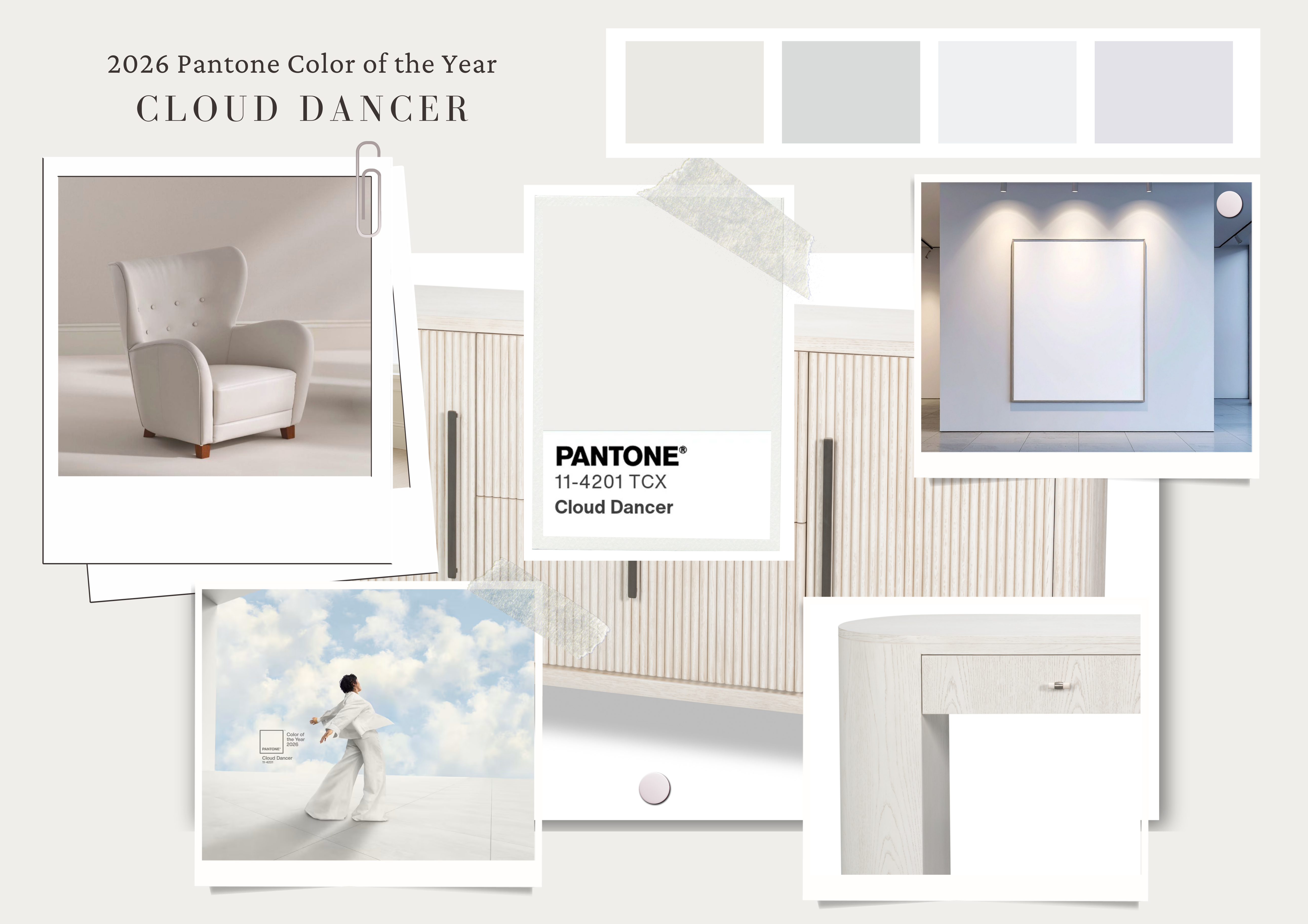

Each December, the design world waits for Pantone’s Color of the Year announcement — that single shade that captures the cultural mood and sets the tone for interiors, fashion, branding, and beyond.
For 2026, Pantone surprised many by choosing Cloud Dancer, a soft, breathable white that feels airy, calm, and quietly luminous.
The choice raised our eyebrows at first.
After all — color is everywhere right now.
Designers are embracing bold blues, rich greens, muted burgundies, ochres, and warm terracottas. Pattern, depth, and expressive palettes are having a renaissance. So why, in a moment bursting with chromatic energy, would Pantone choose white?
It’s actually much more aligned with the current design landscape than it seems.
White Is the Counterbalance That Makes Color Sing
As designers increasingly layer spaces with saturated hues and personality-driven palettes, there’s a growing need for balance.
Cloud Dancer represents that — a soft pause amidst richer tones.

Instead of competing with the color movement, Pantone is elevating the importance of the canvas underneath it. White allows color to be fearless. It gives the eye a resting place so bolder choices feel intentional, not overwhelming.
In short: Cloud Dancer isn’t the absence of color.
It’s the frame that makes color more powerful.
A “Living White,” Not a Stark One
What makes Cloud Dancer special is its softness.
Pantone didn’t select a bright, sterile white — they chose one with warmth, breathability, and subtle depth.
This is a white that feels:
- fresh but not cold
- timeless but still modern
- neutral but never flat
It’s the kind of white that supports layered design rather than washing it out. And it resonates deeply with the quiet-luxury and “edited home” movements happening parallel to maximalist trends.

A Design Reset for a World That’s Been Overstimulated
The last decade of design has swung between extremes: from cool neutrals to pattern play, from minimalism to energetic “dopamine brights.” Now, many homeowners and designers are craving clarity — not less creativity, but more intentionality.
Cloud Dancer symbolizes that reset.
A moment to breathe, edit, reflect, and begin again.
It’s the perfect foundation shade for 2026: calm, clean, and endlessly adaptable.

Why Cloud Dancer Is Especially Good News for Sarreid
At Sarreid, white finishes have long been part of our design language. The announcement of Cloud Dancer simply reinforces the relevance of what we already do so well.
Our white pieces naturally embody Pantone’s message for 2026: freshness, lightness, balance, intention.

They serve as anchor points in colorful rooms, offering structure and serenity. They complement bold textiles, rich woods, and layered design moments without overpowering them.
In a year when the design world explores richer palettes, Sarreid’s whites shine as the grounding elements — the pieces that pull a room together and allow color to stand out beautifully.
We’re highlighting our top 10 white pieces below:

- The Brighton Side Chair

2. The Casual Jupe Table in Working White

3. Hugo Oval Side Chair in Cortina White

4. Gabriella Shagreen Nightstand in Osprey White

5. Classic Chinese Coffee Table in Vintage White

6. Marksman Sideboard in Whitewash

7. White Swan Tall Sideboard in Whitewash

8. Deco Side Chair in Cortina White

9. Crested Wall Cabinet in White

10. Shagreen Books in Ospry White
Pantone’s choice may seem surprising at first, but Cloud Dancer captures a fundamental truth: great design isn’t just about color — it’s about harmony.
As we head into 2026, designers can embrace the best of both worlds:
- expressive color
- balanced by soft, intentional white
- grounded by materials and craft
- elevated through thoughtful contrast
Cloud Dancer gives us permission to enjoy color boldly while creating homes that still feel calm, luxurious, and deeply livable.
And at Sarreid, we’re already fluent in that language.
Leave a Reply