
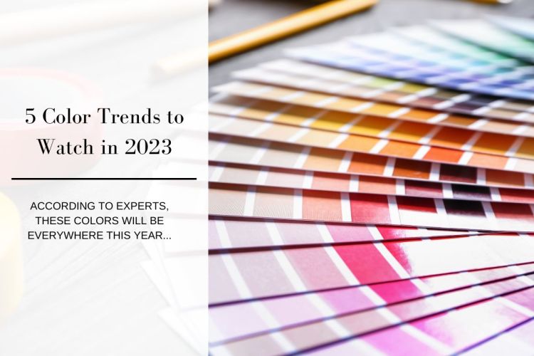
As we march into Spring, and into High Point Market 2023, not only do we see blooming colors taking shape outside our windows, we also notice the color trends that are taking shape in the design world for the year. We decided to do a little research to find out what the design experts are predicting to be the most important shades to watch.
1. Bold Reds
According to House Beautiful red is making a comeback. Designer Sarah Stacey says, “Try pairing red accents, like dining chairs or smaller accent pieces, with neutrals to bring more of an emphasis to the color. Benjamin Moore announced its 2023 Color of the Year as Raspberry Blush, a fiery red-orange that’s basically the best color in a really good sunset.

2. Unexpected Greens
Veranda Magazine, recently stated that midtone greens are taking over homes because of their ability to play to nature. Andrea Mango, color marketing director at Benjamin Moore believes unique shades of green—such as Savannah Green, which was featured in the brand’s Color Trends 2023 palette—are apt to make their way into the home.

3. Cool Lavenders and Lilacs
Elle Décor says, “An emerging color trend that demonstrates the power of newly initiated Gen-Z consumers is the rise of soft, dusty shades of lavender and lilac. 1stDibs, the digital antiques marketplace, saw interest in lavender spike in 2022, up to 14 percent over 6 percent approval the previous year.” WGSN’s color strategist Clare Smith, predicts the color will dominate tabletop and soft furnishings, in addition to our walls. “It’s a sensorial shade that connects to holistic well-being and digital optimism,” they tell us.

4. Reimagined Blues
According to Forbes Home “we’ll see soft blues and iridescent blues, daring hues will be used as accents throughout the home. This year, blues are reimagined to display carefree confidence to encourage inventiveness and creativity.”

5. Warmer Neutrals
In a recent Marthastewart.com article, Joa Studholme, color curator at Farrow & Ball says,”There is certainly a move away from the cooler gray tones, so beloved for the last decade, to those that feel kinder and warmer. We now want colors that are lasting experiences in our homes and reflect a little more of our personality.” She suggests the brand’s Stirabout and slightly stronger Jitney—both still have an underlying gray, but give homeowners a chance to embrace earthy, subtle tones that warm and nourish.

Sarreid shares the love of color as you can see below….


Leave a Reply